Quotient — Streamlining training management with a custom app.
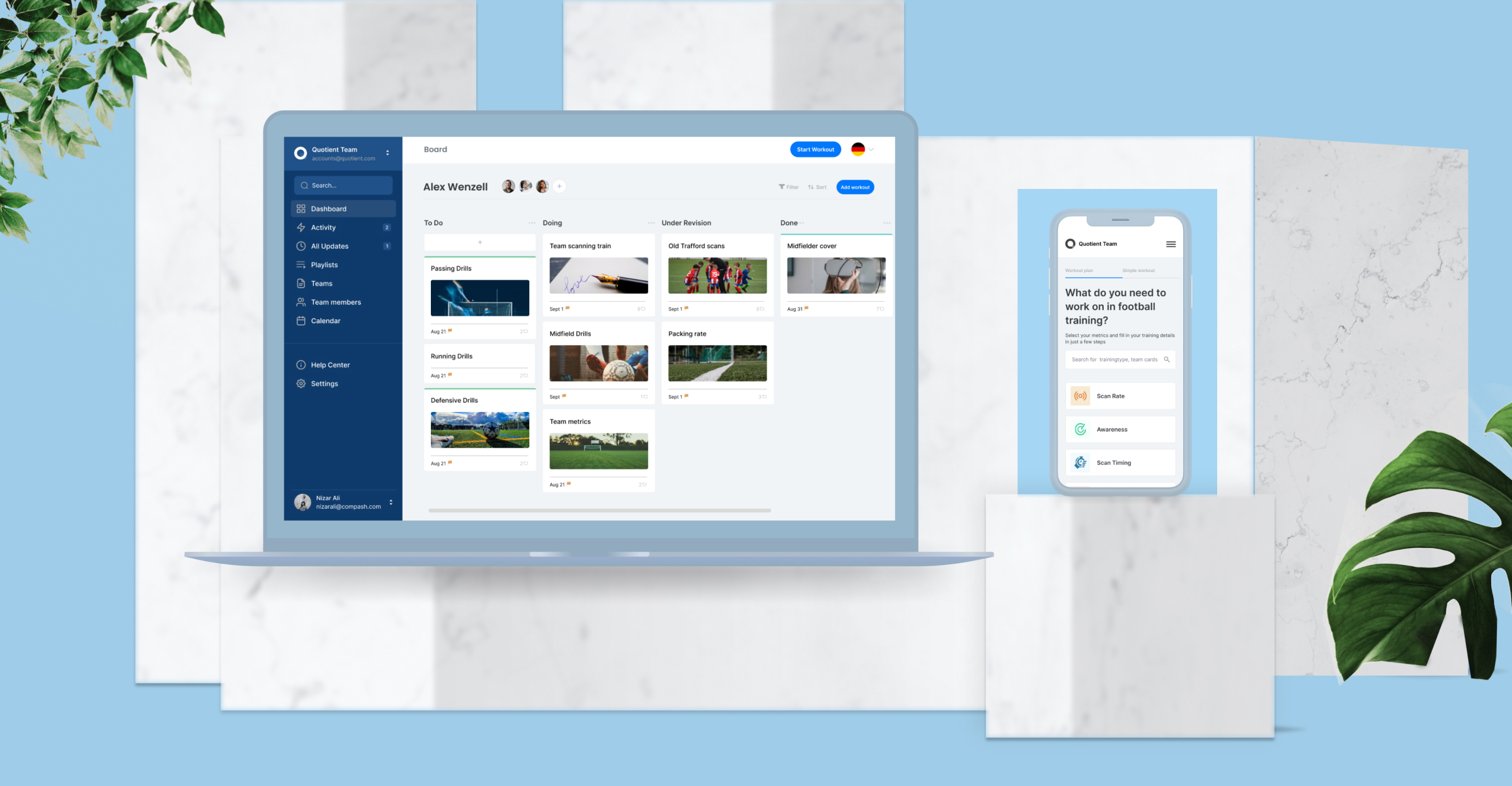
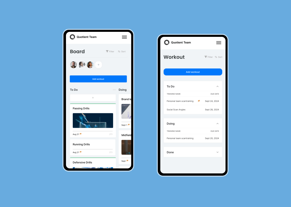
Quotient offers an scan training subscription to teams of all leagues. The company aimed to transition from web portal to a custom web application that would streamline the training request and approval process for members, as well as provide a centralized platform for internal team to manage and delegate work training.
I worked for 3 months with the company founder in a discovery session to understand better and outline the problems we needed to solve together. We discovered a series of challenges we needed to face to improve the overall customer experience and satisfaction while keeping the internal team synchronized and productive with all the playlists.
A user-centered approach
In order to validate the identified product problems and challenges, I conducted user research to ensure that the targeted pain points effectively addressed user problems and improved business outcomes. Our overall process had 5 stages:
- Product and market research
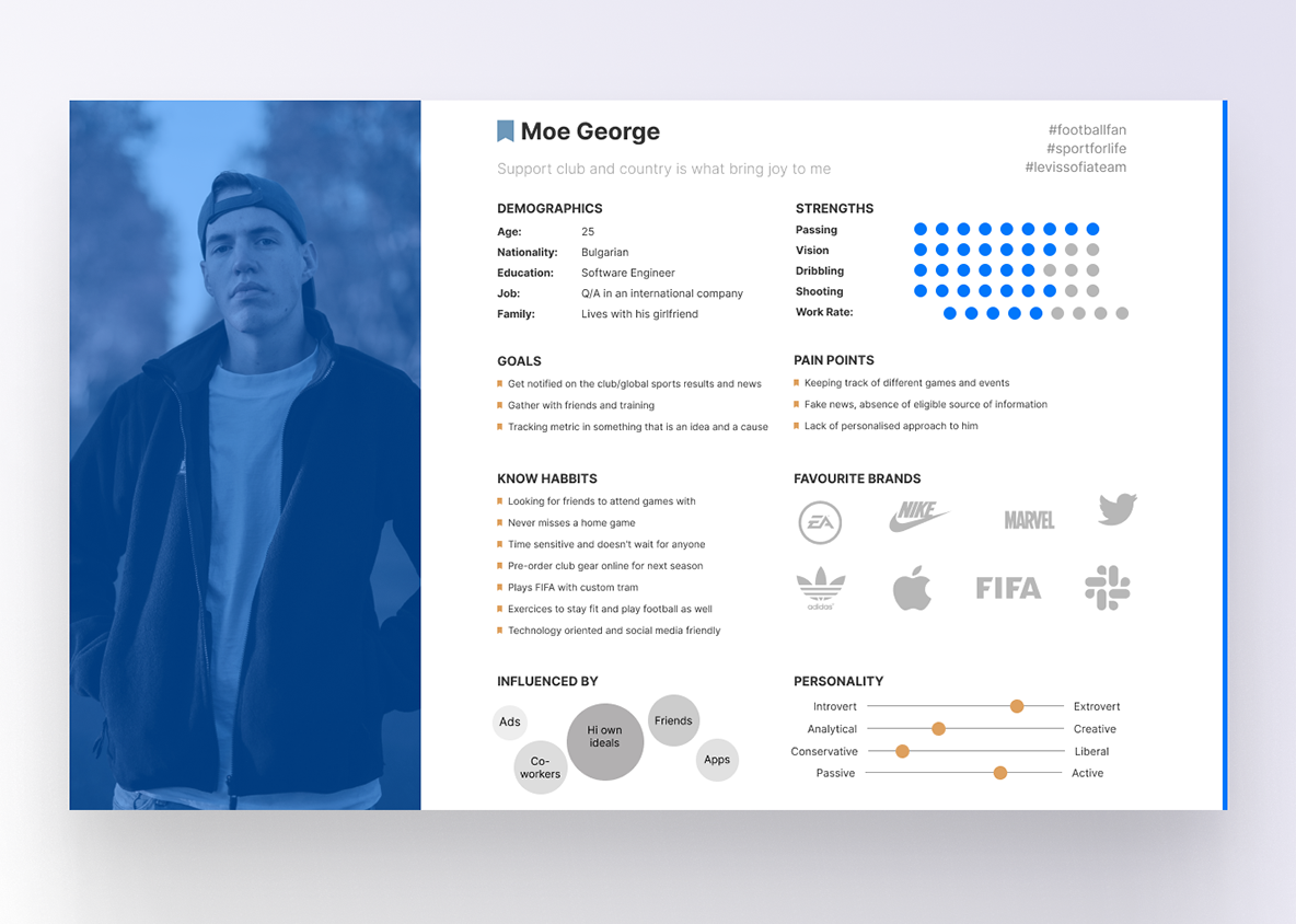
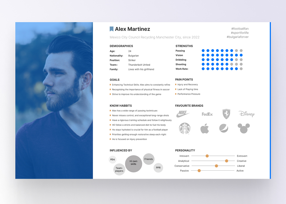
- User personas
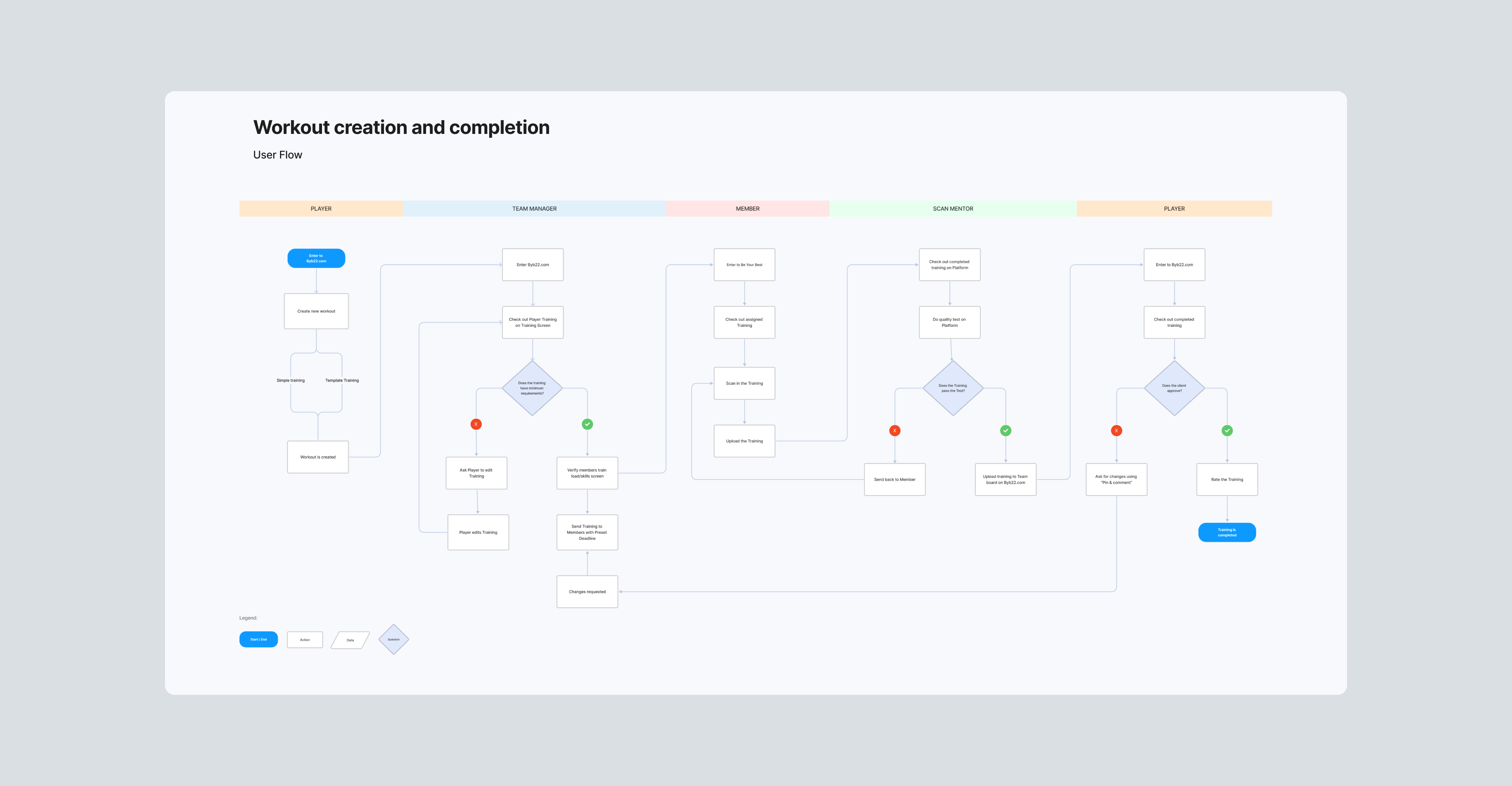
- User flows
- Wireframes
- Design & prototype


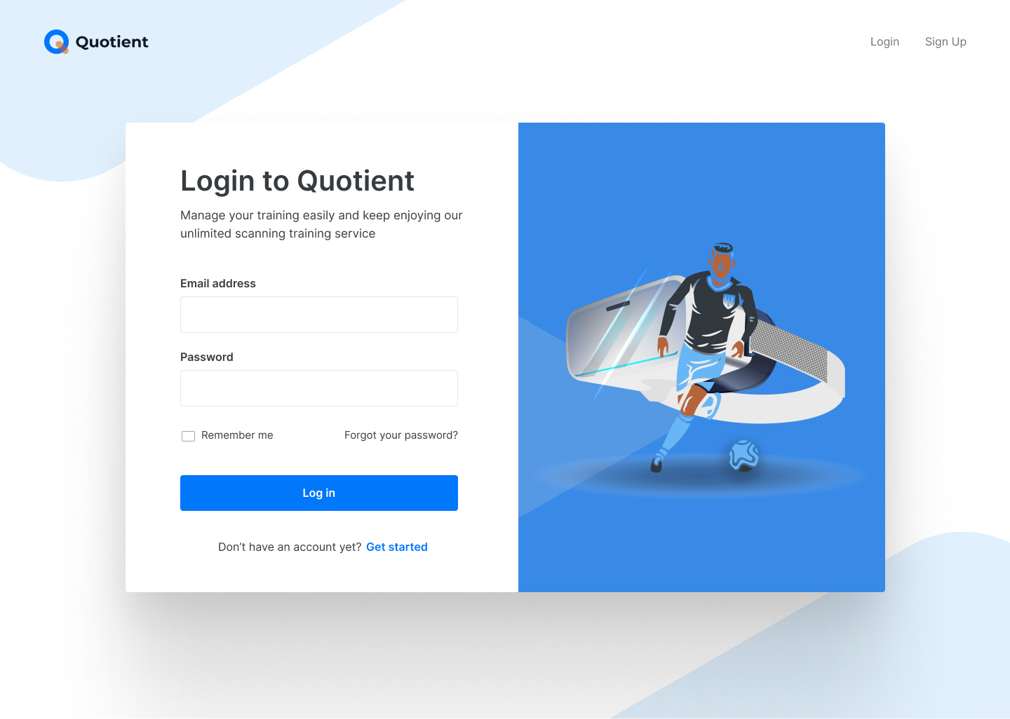
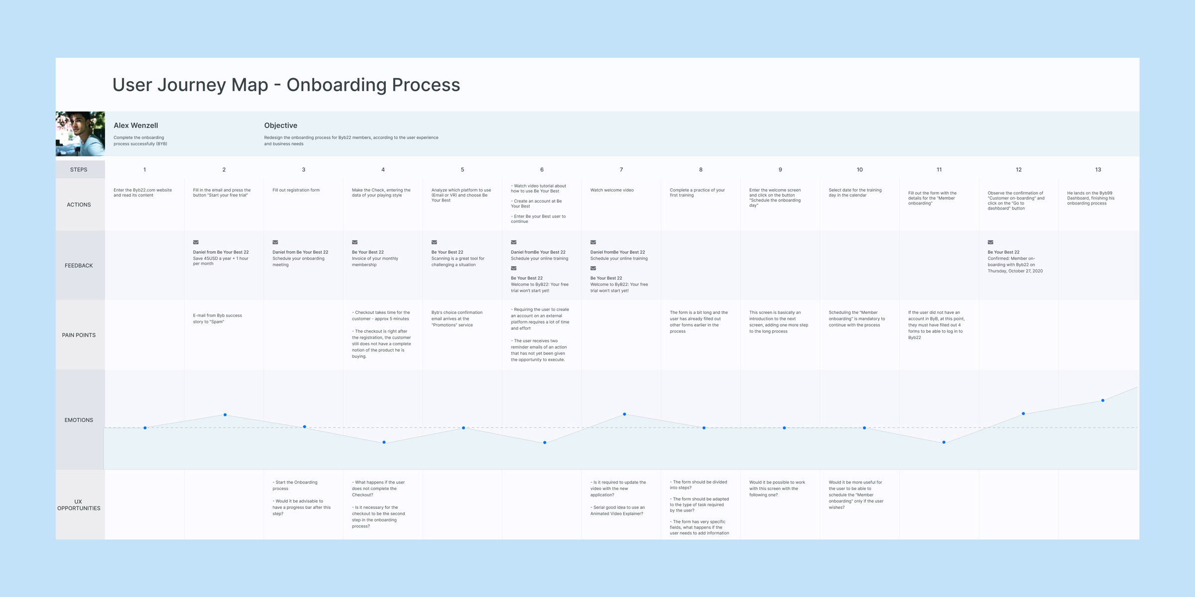
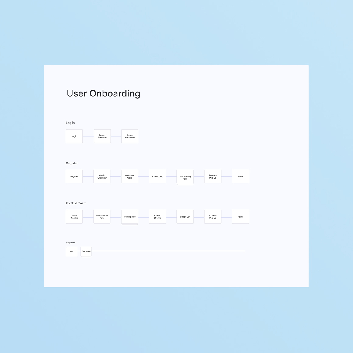
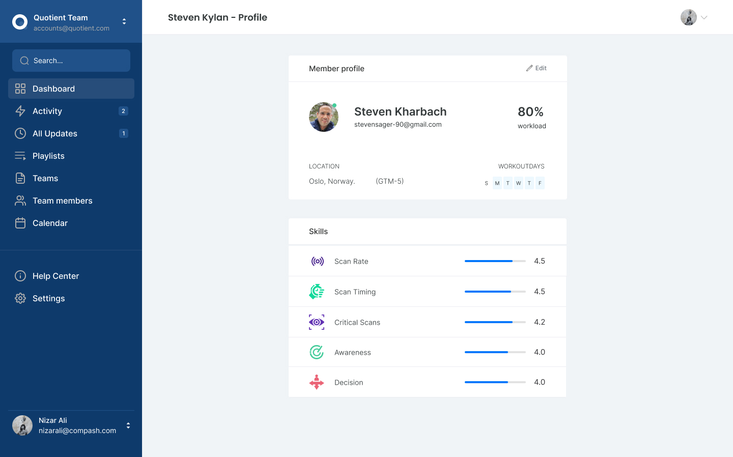
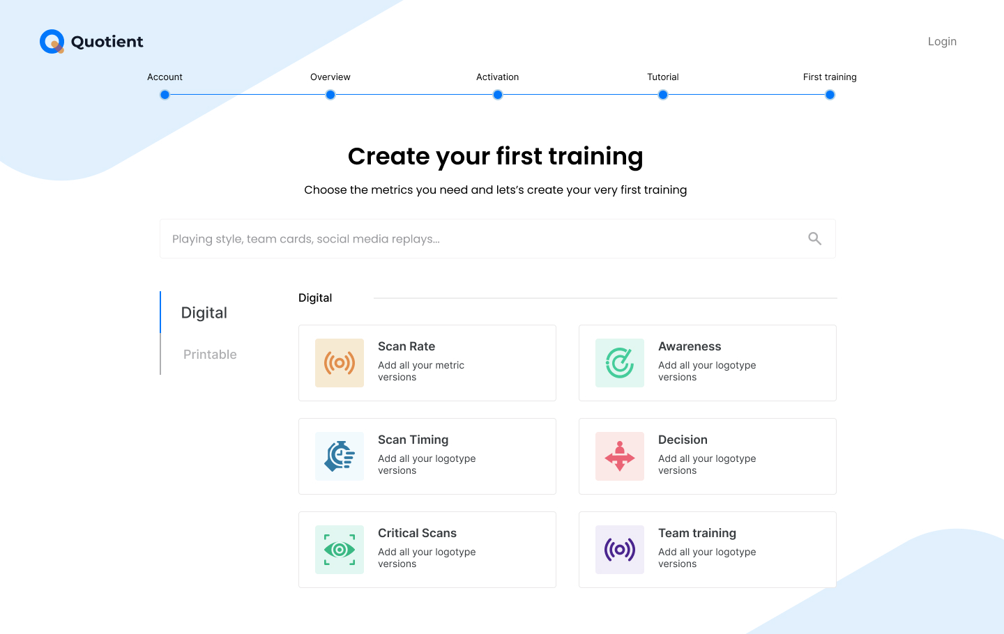
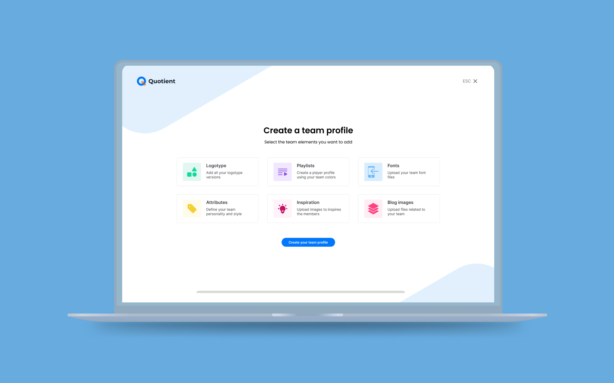
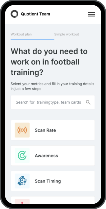
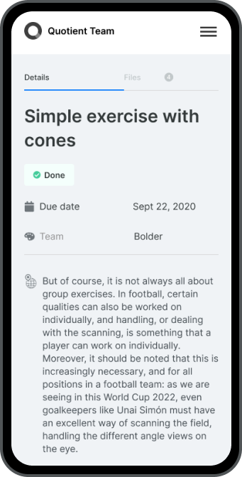
The user journey helped us to map out better the decisions and processes the users needed to take in order to accomplish their objectives within the application. We used that information to define new user flows covering everything from logging in and registering to requesting and completing trainings.

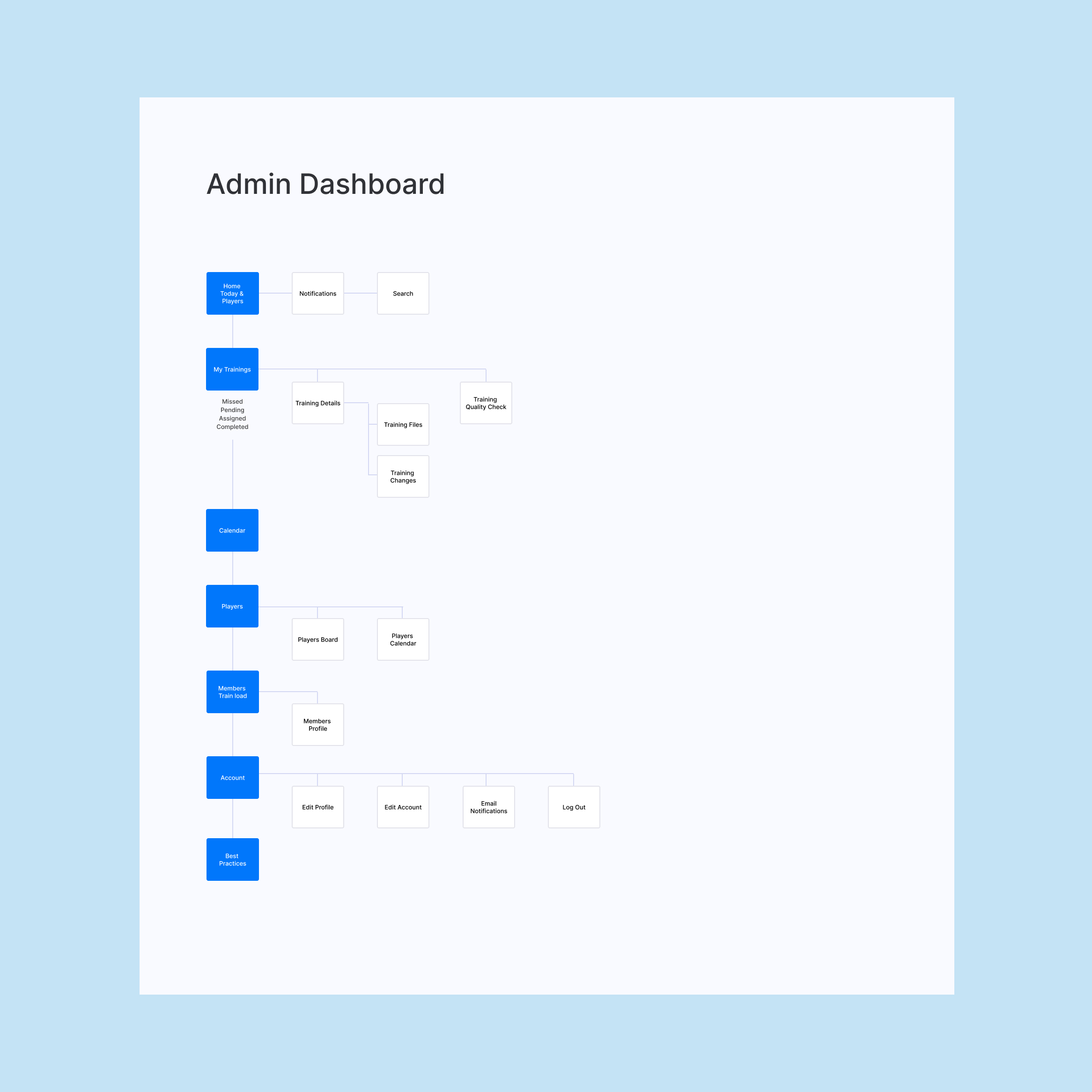
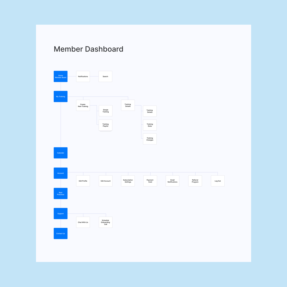
Mapping out the whole application
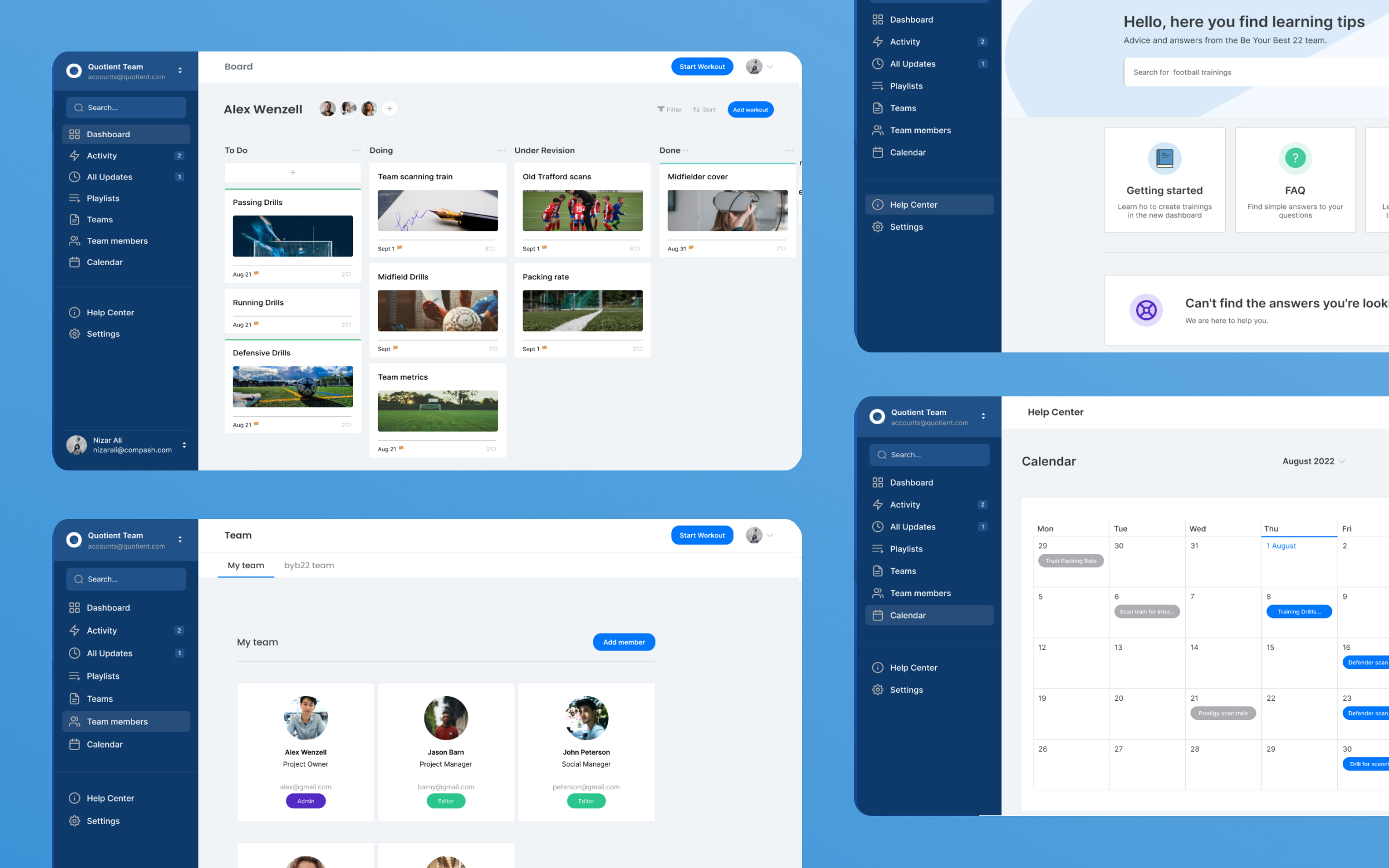
A complex application such as this requires a clear and organized information structure. Through my research, I determined the need for distinct user groups with varying levels of control and access to effectively operate the application. To facilitate this, I created site maps for each user group to visualize the necessary screens to achieve their goals in a user-friendly way.

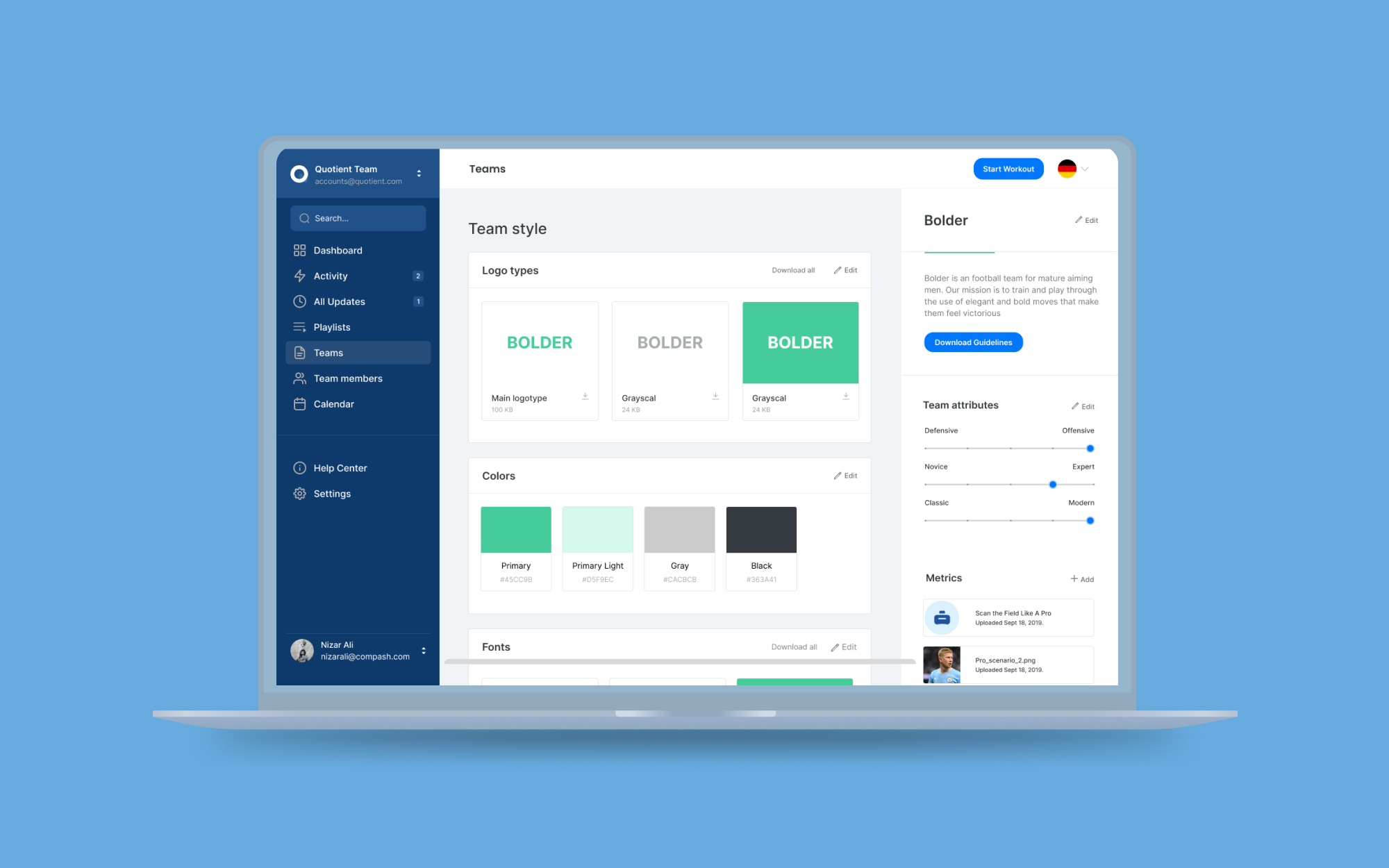
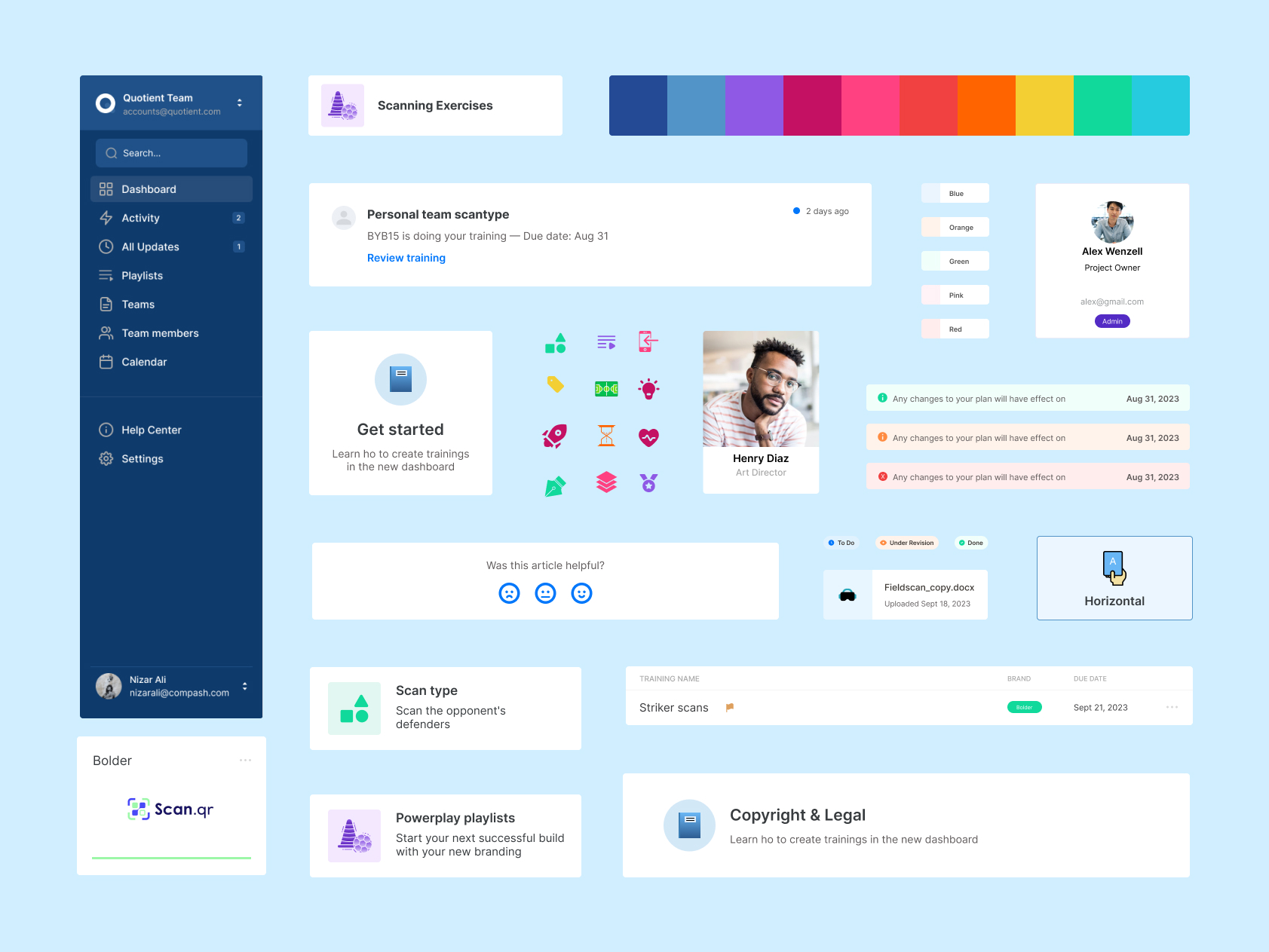
Using a design system to define the visual experience
I aimed to ensure the application was visually cohesive across all of its multiple components. I used Figma to create a set of reusable components to keep typography, color, spacing, icons, and imagery coherent and appealing. This strategy helped me maintain a consistent design throughout the 100+ screens we created during the design phase.


Next project
Wellness House
