What should go on a sales page?

Dashboard design mockup with floating UI elements

What is it? A sales page (or landing page).

What’s the objective? To SELL something—right there on that page!

Creating a successful sales page is a little bit art, a little bit science. I frequently get asked to develop sales pages for clients, and today I want to dive into the details. Here are my tips on creating a sales page that gets the job done.

What is a sales page?

A sales page is designed with a singular focus: to convert visitors into customers. While your homepage might have a few calls to action, your sales page only has one—encouraging visitors to take a singular action.

What is your objective?

Your sales page has a purpose—to get somebody to do one specific thing: buy a product, schedule a meeting, apply for something, get a limited-time offer—take a certain action. I have a sales page myself, and its objective is to sell my client onboarding toolkit. (I can tell you first hand, it works!) The key is to get crystal clear on what you want your visitors to do; this clarity will guide every element of your page.

How are people getting there?

To get eyes on your page (and sales in your shopping cart), you need to actively drive traffic to it. Use your social media channels, newsletters, and Google Ads to direct potential customers to this focused page. When visitors arrive, it’s your time to shine! So how can we best do that? Employ the characteristics of a good sales page…

A good sales page will be:

To get eyes on your page (and sales in your shopping cart), you need to actively drive traffic to it. Use your social media channels, newsletters, and Google Ads to direct potential customers to this focused page. When visitors arrive, it’s your time to shine! So how can we best do that? Employ the characteristics of a good sales page…

  • Distraction-free: You want eyes on the prize—no distractions! Because of this, you might include your logo (or not) and leave out your navigation, allowing visitors to focus solely on the content and call to action. You may include a footer, but a pared-down version might be best.
  • Designed for your audience: It could look like your website, or it could look completely different. This would depend on what you’re selling, who the audience is, and what their needs are. (So yes, this page may have its own brand entirely.) While it’s still attached to your WordPress website so you can edit it, it might have very little in common with the rest of the site.
  • Ordered in a smart, intentional and convincing way: While the order isn’t totally black and white, sales pages seem to do best when they have a similar flow to the content. You are taking the reader on a journey to where they are motivated enough to buy. This means you have to inform, nurture and compel, but not overwhelm.

How should you structure your sales page?

Overall the content should be skimmable, with bullet points and bold text, so folks can skip over the sections they don’t need.

  1. Start by presenting the problem, so they can relate. Set the stage. Address the common issues your audience will relate to. We want them to think, “Yes, that’s me!”
  2. Introduce the product, with all of its benefits and features. Since those benefits and features solve the problem you’ve defined above, a connection is being made.
  3. Share testimonials about the product. Let prospects see how much your offering helped others like them. These can be in a specific section, or scattered throughout the page.
  4. A detailed pricing section towards the bottom of the page, which explains any different tiers you’re offering.
  5. Multiple calls to action throughout the page, allowing visitors to click “Buy” whenever they feel ready. These calls to action generally start around the middle of the page, and take people down to the detailed pricing section. These are important because some folks might not need to read the whole page in order to be convinced, and the moment they feel ready, we want them to act.
  6. FAQs, in case they have any hesitations. Answer common questions while strengthening the value of your offering.
  7. Some kind of guarantee. Provide a money-back guarantee, or refund within 30 days, so they can feel confident purchasing.

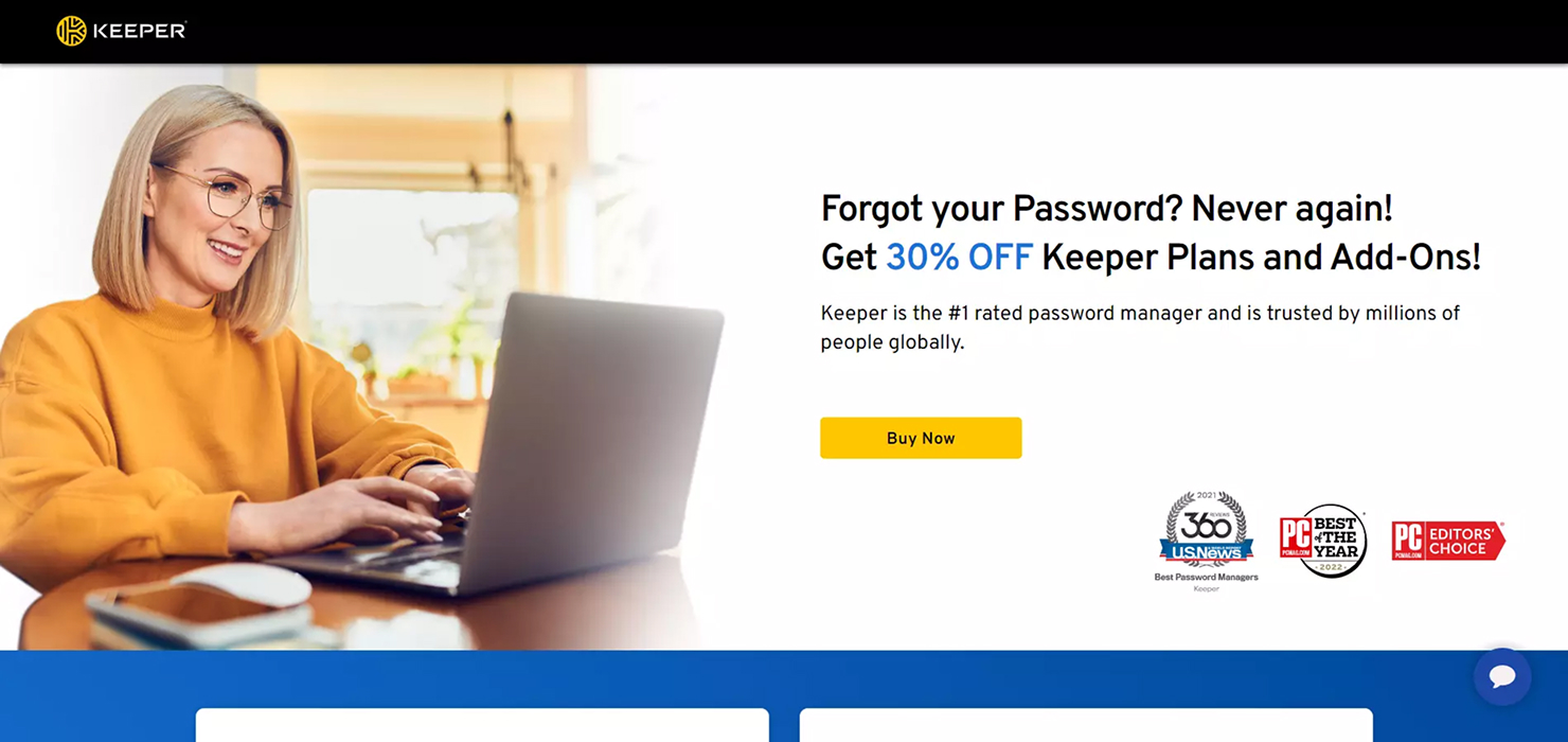
Examples of sales pages

Here are a few sales pages I’ve created for my clients (and myself!):

About Mo Dyani

Hi, I’m Mo, a Webflow web designer/developer who partners with talented designers, copywriters, and agencies on their websites, and their client’s sites. I’m passionate about crafting beautiful and innovative Webflow websites focused on clear positioning and 
positive user experiences. Get my free report, Get Your Website Done: 12 Actionable Steps for Designers, and check out my Client Onboarding Toolkit, a simple 4-step digital course for converting prospects into a paying clients.

Blog circle icon

Like this? Get new posts via email.

No spam, no worries. Just my monthly(ish) blog posts straight to your inbox.

Thank you! Your submission has been received!
Oops! Something went wrong while submitting the form.

“Thank you for your steadfast support and expertise.

“You took the original vision, a handful of images, and our colors and crafted something that was so much more. The quality of our site has given me the confidence I need to write new blog posts and drive traffic to it as a resource. Often, people I speak with that have navigated the pages offer unprompted praise. I am grateful for the initial work and the ongoing maintenance and revisions we make together.”

A client testimonial masked into a oval thumbnail
Nils Baarsen

“Working with Mo has been a smooth, effective, happy process from start to finish.

“He is a great listener who took the time not just to understand what we wanted done, but also to get to know our ‘organizational personality.’ He executed what we wanted flawlessly. We tried not to have too many last minute, ‘urgent’ requests, but they did happen (sorry, Mo!)—and he always helped immediately! Knowing that he's watching over our site's backend has also been amazing so we don't have to worry about it.”

A client testimonial masked into a oval thumbnail
Olivia Wang

“Equally talented designer, as well as web developer, Mo has become an integral part of every project I've launched.

“No kidding, I sleep better knowing Mol's there, for updates, for design tweaks, for—basically—everything.”

A client testimonial masked into a oval thumbnail
Oliver Berg

“Thank you so much for all you do for my team. You are always there to support us and fix things. You are so appreciated!”

“He is a great listener who took the time not just to understand what we wanted done, but also to get to know our ‘organizational personality.’ He executed what we wanted flawlessly. We tried not to have too many last minute, ‘urgent’ requests, but they did happen (sorry, Mo!)—and he always helped immediately! Knowing that he's watching over our site's backend has also been amazing so we don't have to worry about it.”

A client testimonial masked into a oval thumbnail
Grete Torgersen

“Mo is a rare designer in that he can actually developing too.

“Along with her expertise in Webflow, he understands design, layout, typography and composition. He is also reliable, talented, and extremely easy to work with.”

A client testimonial masked into a oval thumbnail
Astrid Larsen

“Mo is an amazing resource for any creative professional.

“In almost 20 years working with creatives, he’s one of the few whose design, marketing and programming skills are equally strong. He asked all the right questions, listened carefully to what I was looking to achieve and exceeded my expectations with his first round of creative. Thanks to Mo my website has elevated my brand image. I will be recommending her to all my coaching clients!”

A client testimonial masked into a oval thumbnail
Sigrid Larsen

“Working with Mo is the best thing I’ve done for my design business.

“For years, I've wanted to re-do my website. Partnering with Mo got it done, and I am so happy with the results. Mo is a super talented designer and developer who pays attention to every little detail. Like smart quotes and hanging punctuation! I am thrilled with the Webflow platform, and that I can make the updates myself—It has been so much fun!”

A client testimonial masked into a oval thumbnail
Åse Torgersen

“I want to thank you for the design you did for my new website.

“I’m really happy with how it turned out, and I’ve gotten multiple compliments on the aesthetics of the site. Thanks for your creativity and work on it, and for making sure it worked so well for me. It’s starting to help me and my business out in some important ways.”

A client testimonial masked into a oval thumbnail
Sofie Hansen
Arrow left
Arrow right

Hey designers:

Have you wanted to revamp your website for a while but haven’t gotten very far?

My free interactive pdf will help you check it off the list with 12 actionable steps.

Get it now
Wireframe poster

Want to work together?